Friday 02 November 2012 at 7:00 pm
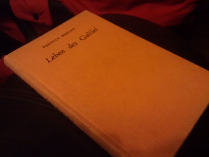
OK, so I've upgraded my tablet from the crappest tablet in the world (see here), to a slightly less crap one. It's still the cheapest of the cheap (a NATPC M009S off eBay - it's got dual-core processor, 16GB NAND, 1GB RAM and a 1024*600 screen, running Jelly Bean, all for £65), but it's smaller than the old one, and so needs a new case.
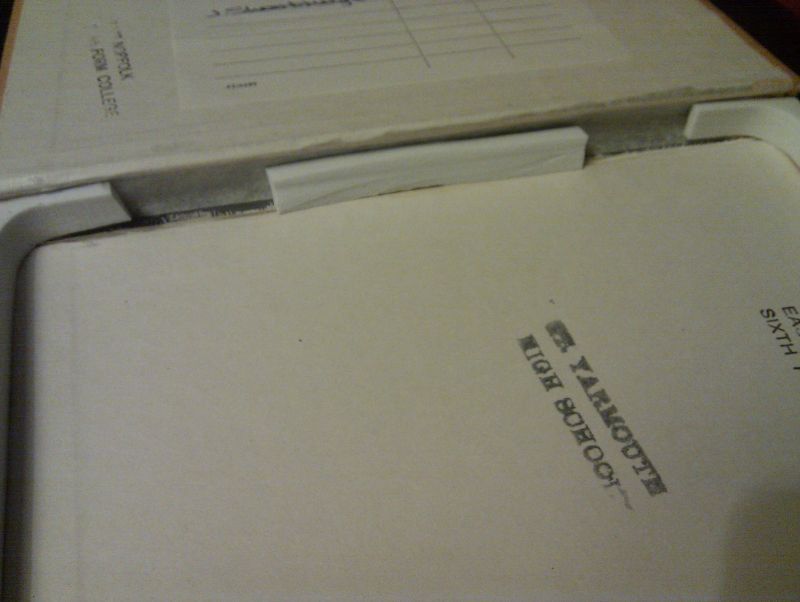
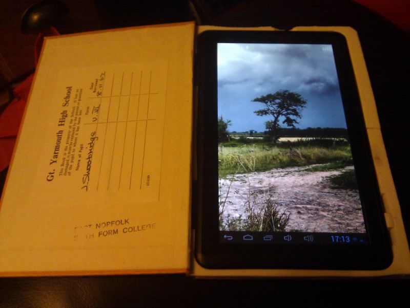
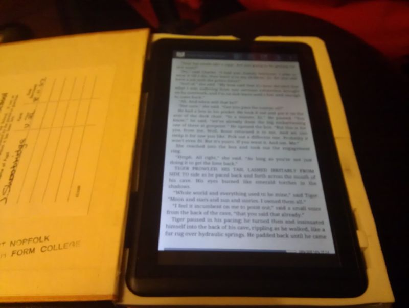
I really couldn't face all that palaver with cutting out pages again, so found this book - of 1962 vintage - which was the perfect size, and used the foam packaging which came in the new tablet's box, glued around the edges. Extra little cube at the lower right enables me to press the power button and use it without taking it out of the book.
Plus it's just about perfectly pretentious enough to be reading Brecht (in the original German, naturally), when I'm sitting having my lunch. "You reading Leben des Galilei there, Daniel?" "Yeah, that's right." I don't even speak German, tee hee.


Friday 21 September 2012 at 1:05 pm
I was asked by a student with limited mobility how he could use the Windows On-screen Keyboard (accessed by Windows+U from the login screen) to send the Ctrl+Alt+Del login keystroke.
No amount of Googling revealed the answer, I tried amending our Group Policy for Secure Attention Sequence (SAS), but nothing worked.
I stumbled upon the answer - use Ctrl + AltGr + Del. The AltGr is to the right of the spacebar. Login prompt then appears.
Monday 23 July 2012 at 2:00 pm
As an atheist, as far as I'm concerned a church is a big pile of stones which uses up valuable land, gets in the way and causes old people who only drive on a Sunday to veer dangerously along my road. However, some people seem to like it and have ideas about 'tradition' and that sort of thing. And yes, I suppose some of the architecture is quite nice.
What does get me riled is when the right-on vicar (who, as an aside, is constantly begging for cash for the church whilst driving a brand-new convertible) of the local church starts ripping out pews and internal fittings and replacing them with plastic chairs for that 'community centre' feel (even though the village already has at least one community building). The other day I walked via the churchyard to the local shop to see this dumped unceremoniously outside the front door of the church.


It's the remains of a pipe organ, and whilst I'm sure the argument would be that it was broken and beyond economic repair, it doesn't quite seem 'right' or respectful to simply dump an old instrument like that in plain view. It insults the eye, the congregation and the craft of the maker of what was once a beautiful instrument, however misguided and peculiar the beliefs of those who venture inside the medieval building. Give it a decent burial, a ceremonial pyre or at least hire a skip.
Expect to see parishioners' corpses dumped outside in a pile soon. I should probably write and complain to the incredible publication that is the Village Voice but they'd probably just spell my name wrong and get all the apostrophes in the wrong place. You can if you want.
<Edit> A fortnight later, it's still there.
Monday 23 July 2012 at 1:53 pm
When trying to find the words to describe a girl without being disrespectful, may I suggest that any comparison to the neighbourhood whore, however favourable, is not the best place to start.
Saturday 23 June 2012 at 1:29 pm
I am the (proud) owner of the world's crappiest Android tablet, a Scroll 7" with resistive screen. Most of it doesn't work, since I rooted it and stripped out all but the most basic of its functions to try and increase battery life. I now use it for 2 things - reading ebooks and occasionally watching movies (ripped from DVD to AVI format) in bed. I'd considered a Kindle but the lack of a backlight makes it useless for bedtime reading.
So what better case for an ebook reader than an actual book? There are lots of different instructions on the internet, so I basically followed one like this on instructables, using some good-quality PVA glue (diluted) and a makeshift clamp/press made from 2 blocks of timber and some nuts & bolts. Basically keep a few pages at the front, protect the front cover and these pages with plastic & masking tape, then brush the PVA mixture into the page edges. Clamp and leave to dry. Then get a nice sharp blade - I used a Stanley knife with a new blade - and cut out your rectangle. I did try drilling out the corners for a smooth finish but it made more mess than it saved.
Once cut to size (I had to allow a cutout for the side buttons and a finger recess for pulling the tablet out), brush on more PVA, clamp and dry. With good-quality PVA it dries really nice & solid, so much so that I could sand the inside to fit using a Dremel-type mini drum sander. To finish you can put back some of the first pages you retained and carefully cut out the aperture to give a nice finish.
Of course, when you have the world's crappiest tablet there's not a huge amount of point in trying to protect it, but I'd always wanted to do a hollow book project. Plus it was a really dull book!
Pics:
UPDATE - I've got a new, smaller tablet with a new book-case project. Here.
Friday 22 June 2012 at 8:11 pm
Here's the latest knocked-up-in-my-shed invention...
My son, a keen photographer, particularly of BMX and skateboarding folk (linky here), wanted one of these:

so of course ol' dad said "I've got an old bit of lawnmower handle that looks like that, I'll make one for ya." So the prototype looked like this:
Which the darling boy described as 'The council estate of camera mounts'. Charming. So then I found some bits of discarded broken tripod in my work's AV department and tarted it up a bit:
Design details are: The main bit is a piece of lawnmower handle - it already had one bend in it so I had to add another to make the C-shape. I have no pipe bender which is why it kinked!
Handle is off a broken tripod - the hole was far too wide so I had to fabricate plastic washers to glue in, with some pipe lagging in the void bit. I then glued on an endcap
Tripod head - this luckily fitted straight on, and gives the angle adjustment that the shop-bought one lacks!
The final tarting-up was a layer of gaffer tape, for decoration really. In fact it looks a bit rubbish so I might find something else, or maybe paint it.
I've tried, filming my 2-year old running around the house and the balance is pretty good. Angle adjustment is useful too. Maybe when I give it to the boy he'll do amazing things with it!
![]()
Thursday 12 April 2012 at 2:47 pm
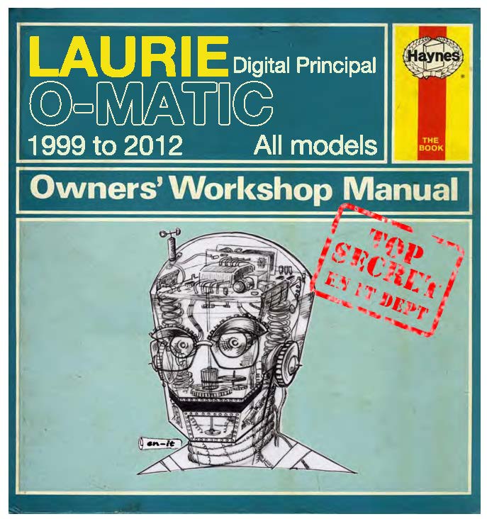
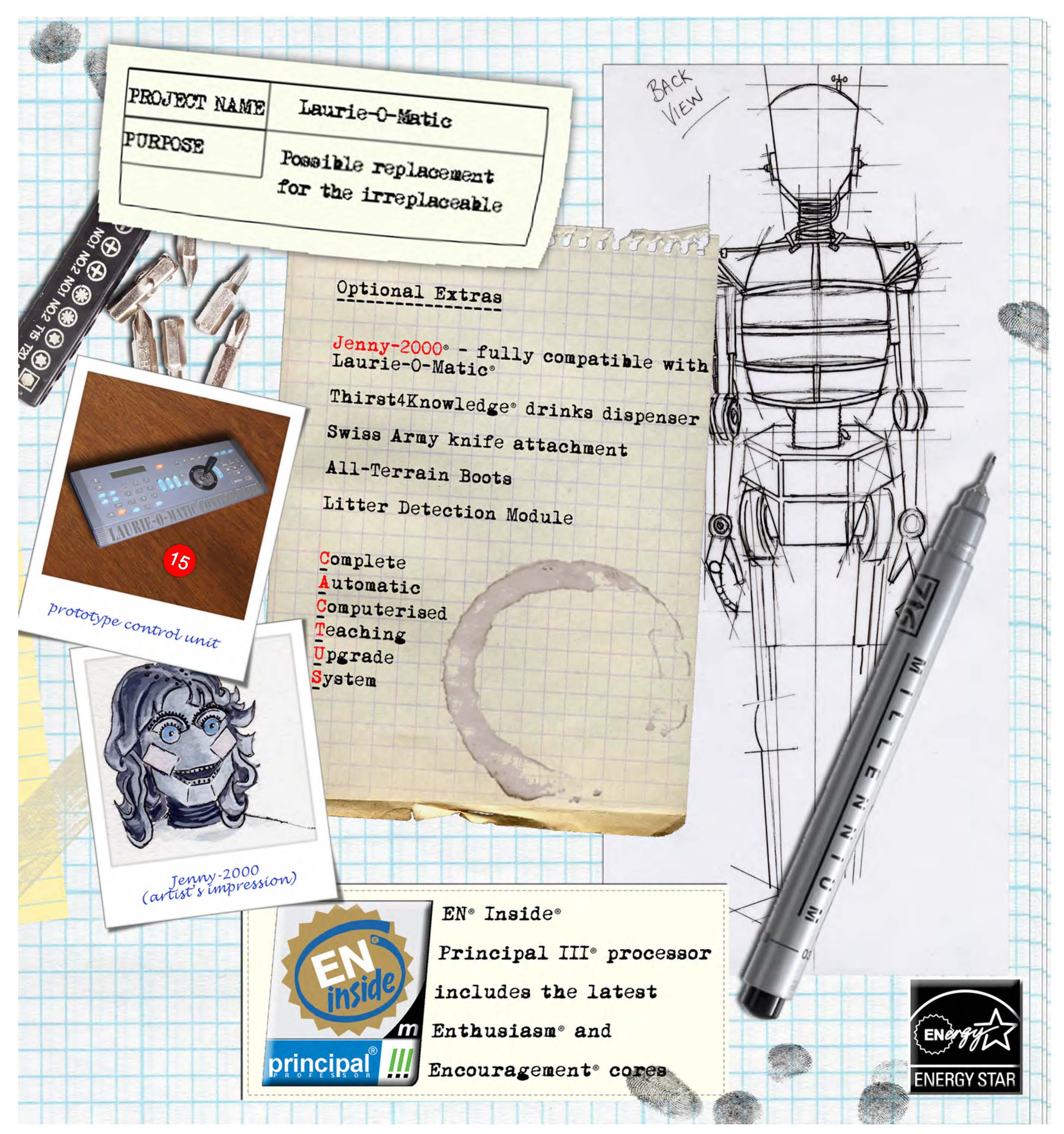
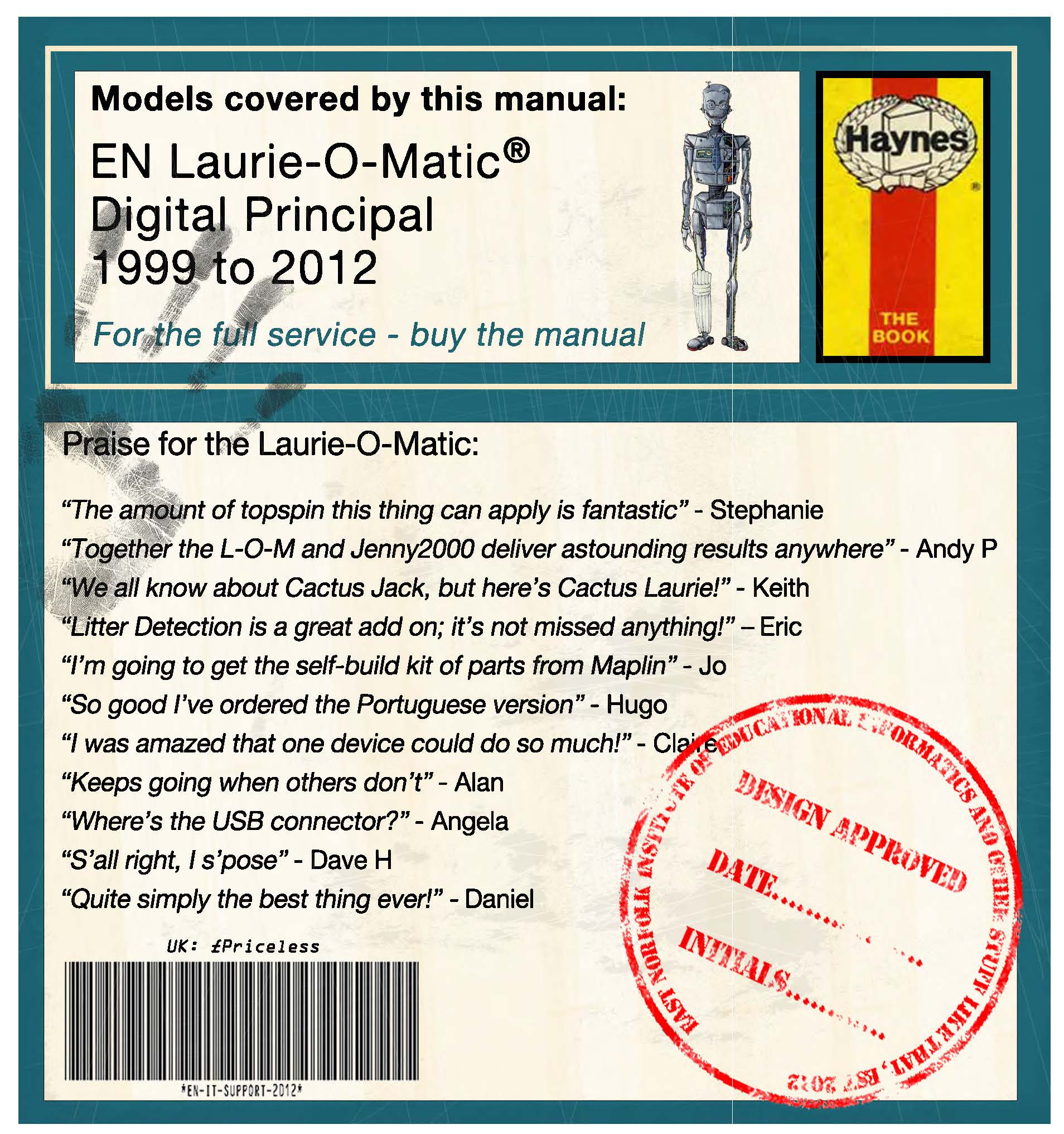
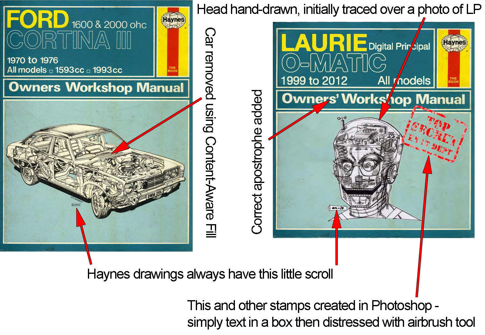
As mentioned in the previous post, this is the reason I was looking for a Haynes manual font. The principal of the college where I work recently retired, and each department was given a couple of pages of a loose-leaf scrapbook to fill with whatever we liked. Many chose stories and poems, and other memories of his 13-year tenure as an extremely popular principal.
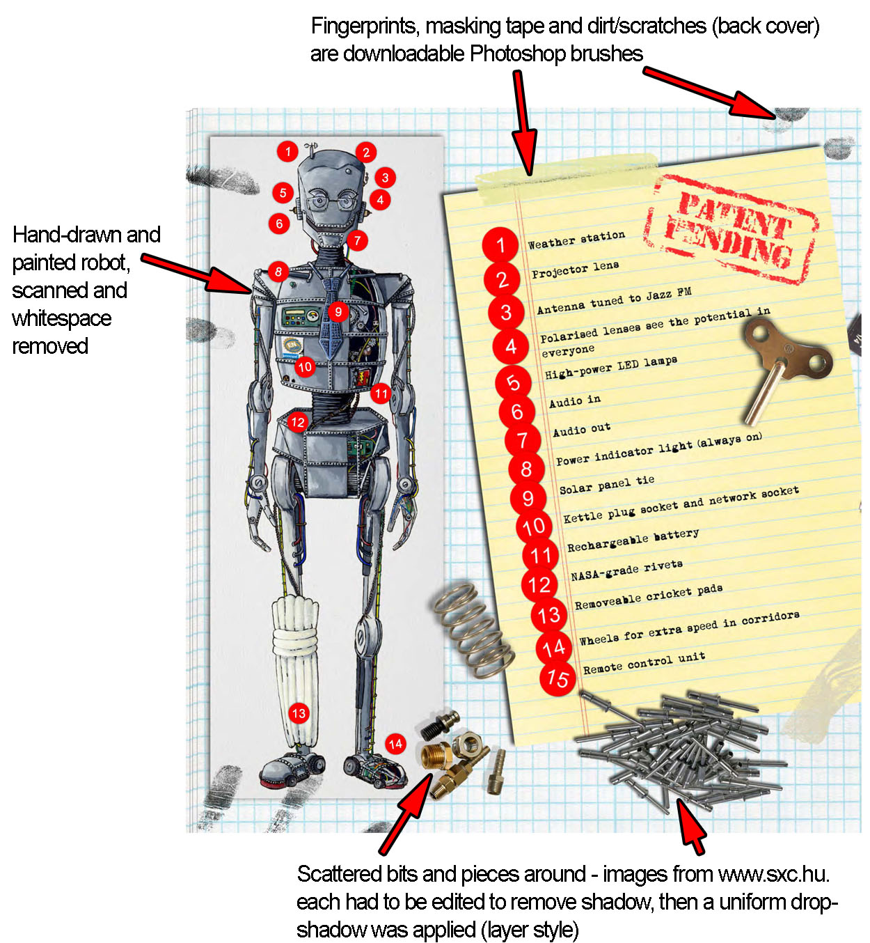
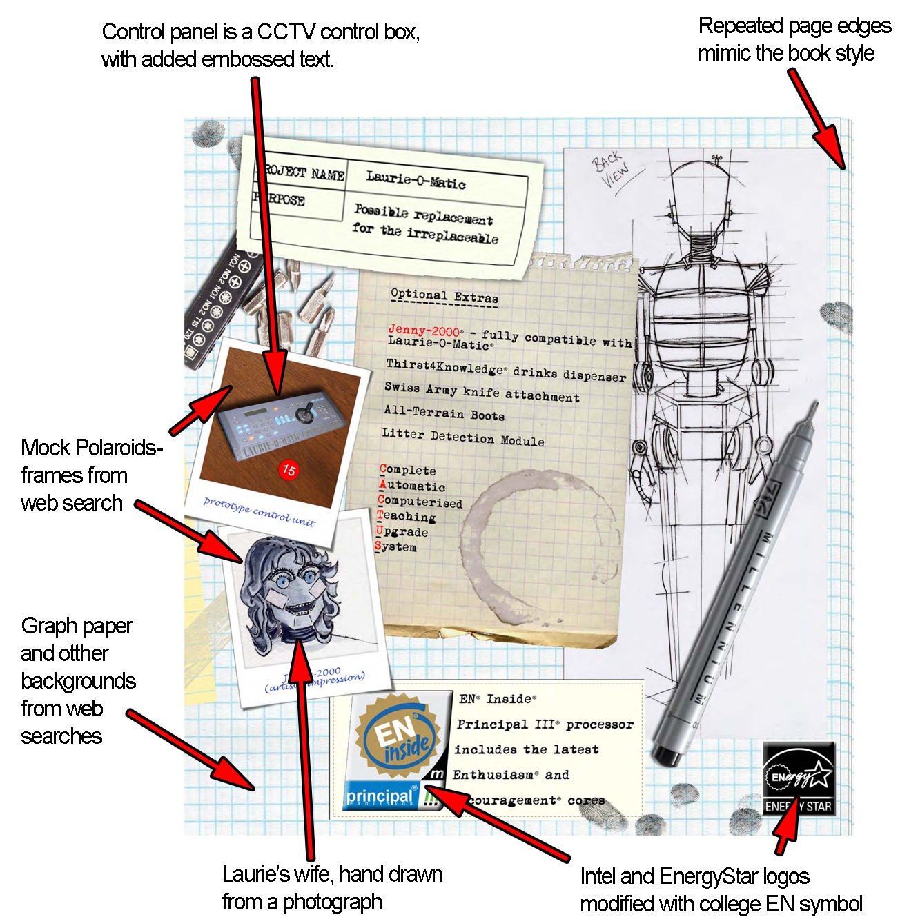
We in IT support wanted a more geeky way of celebrating the great man, and a colleague of mine came up with the idea of the robot Laurie, inspired by the Wallace & Gromit inventions, which also have a Haynes manual dedicated to them. She designed, drew and painted the robot and I put it all together in Photoshop, complete with dirty fingerprints and workshop 'dirt'. The front page is adapted from a scan of a real Haynes manual I found online.
Anyway here are the finished pages, along with annotated pages showing some of the little details you may have missed (click for full-size).
UPDATE - here's a Flash animated version, with some AfterEffects trickery for the old TV look.
Thursday 15 March 2012 at 3:45 pm
An ongoing Photoshop project is to mock up a Haynes manual (finished article is here), but I've had hell and all trouble finding the right font to mimic the old-style Haynes books.
No amount of Googling came up with the answer, but to help anyone else doing the same thing, the answer is 'Alte Haas Grotesk' which I found on DaFont.com. It's not exact (slightly more rounded) but it's pretty damn close.
So now you know.